
Discussing the new 23dashboard... Join in!
|
|
|
Discussing the new 23dashboard... Join in!
|
|
About 23
Just In
Discover the world from a different angle.
Here's a crop of the latest photos from the around the world. |
Popular photos right now             |


39 comments so far...
Any comments on functionality and look?
That would also solve any problems with long names of photogroups etc.(which you are already aware of, I can see ;)
Looking forward to tomorrow.
I don't mind the pictures on the right, but what about v.2.0 letting one drag the four sections around, or placing them how you like? Hey! I had to ask!
More important: keep the interface clean and simple. (I'm sure you will, but just saying it out loud that I appreciate the clean interface at 23.) Those Other Sites feel that have to clutter up their dashboard views with so much cruft it can be hard to know what to look at.
Not to sound like a spoilsport, but any plans on performance tuning / scaling plans in the future? A more stable 23 would be a killer feature imho.
However, the problem is not in the coding -- we've simply hit the ceiling of our current hardware configuration. We'll be upgrading hardware this month, but we also want to make sure that all the small pieces fit together once we do so.
So please, have patience with us for a tiny while longer...
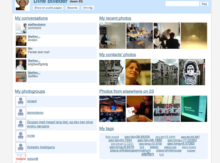
The Photogroups and Conversations are in a single column down the left-hand side, though these are conceptually different things. I think of Photogroups as more as an aggregate of photos rather than the (often missing) "user icon". Perhaps a synopsis view showing the recent changes to Photogroups (maybe along with who last added photos to the group)?
And that big chunk of whitespace under the thumbnails for recent photos is crying out for something. Maybe the recent Photogroup photos can go there?
The Dashboard should be about the photos representing a slice or view into the entire 23 library, tailored to me.
So, one thing would be a proper tag-cloud showing recently used tags by me, and common tags used by others.
Anyway, those are thoughts off the top of my head. Take with a healthy grain of salt.
Does the Just In part make any sense? I'm a big fan of the "28 photos from different users" view because you'll always find something nice -- but only four photos will never have this effect. Perhaps implementing some sort of "23rank" on photos might help selecting better photos. This would also make sense on the main front page.
It might make sense to drop the tag view. I'm not a big tag user myself so I would never use this in any case. In any case it has to be beter contextualized that it is now. All suggestions are welcomed.
I'd like to show more that four recent photos -- possibly 16 (in 50x50) instead? Is there any point to showing your own latest photos? (I think so, since it'll confuse users to log in a not have immediate access to their precious photos. I had a discussion with Thomas on Friday, and he was advocating for something different. Don't recall it now though. I usually don't take our discussions seriously...)
I like seeing an ever-changing selection of photos, as well. If "23Rank" is similar to That Word That That Other Company Trademarked that allows them to mark how, um, "interesting" and photo is, then why not?
I personally like tags, but if they don't fit with your vision, so be it. It can be viewed as current interesting or new metadata flowing into the 23 library, and doesn't take up a lot of room. I admit I rarely use tags clouds (i.e., click on them), but they do carry a lot of information. I sort of treat them like Google AdWords! I glance at them and _occasionally_ click-through.
So, if we keep the column view then perhaps: conversations down the left-hand side, selection of photos (2x4 or 4x4 thumbnails) in the main column.
I'm not sure how Photogroups fits in to this. Perhaps keep them where they are, but rendered differently? I can't help but think that a view that shows the last n photos instead of the photogroup icon might be nice. Not sure where it would go. Upon re-reading your last comments, I actually like the idea of Photogroups rendered as last n photos with comments. Again, not sure of the layout I'd choose.
If we do keep tags, perhaps a cloud of tags rendered as a page footer?
I can do this with the current service but right now, using the dashboard, I don't know what others see and not.
It would be enough to have a small icon or something indicating if a photos is private - i.e. no need to indicate official photos.
What do you think - good or bad idea?
But a "Your Conversations" tab would be much nicer :)
My name is Nicolas.
Looks awesome with the new tab :). Now I don't have to check my mail that often :)
I assume because many of the links regarding my account actually go to the standard "link not found" this is expected, and these links are just place=holders.
Også lige en note til conversations: Der er en masse “løse” samtalebidder — nogle gange fra samme billede, nogle gange med andre billeder ind imellem. Det gør det lidt forvirrende.
Måske kunne man, hvis der var flere kommentarer til ét billede, samle dem sammen med ét thumbnail, og så flere tekstbidder ved det.
Morten, you're probably right about Conversations and the same thing goes for repeating photos in the "Your photosgroups" tab. I'm not sure how to communicate the visually though. I'll have to do some testing.
I'll introduce another item for discussion as well: "Action links". It's something we've been talking about around the company whiteboard for a while. The idea is to encourage actions such "Send photos", "Blog photos", "Create story", "Create slideshow", "Post to photogroup" etc. by including direct links within the dashboard. Such links would apply an action to a collection of photos, and it will also be an important part of the new uploader. (Which will hopefully launch for beta testing within a day or two.)
Haven't you done this already? :)
Regarding the new uploader(and this might be off-topic): Is there any way to overcome the problem I am having when I upload MANY pictures? I uploaded 738 pictures from a Muay Thai event, and I uploaded them chronologically(spell check), but still a bunch of pictures from different fights ended up on some of the last pages of the album, instead of the right places.
First of all, you can sort albums by "Date taken" and by "Date uploaded" (through "Edit this album" -> Sort). If you choose the first option you'll have a neatly sorted album.
The larger point is that the new upload will upload files in order of filename, which should solve your problem, right?
Yes, that should hopefully solve the problem :).
Pictures from some of the first fights of the night appear after pictures of the final winner
It's a month later and finally something's happened to the dashboard. Basically we've changed the design slightly and put it online. You can activate the dash by visiting http://www.23hq.com/23/redirect/a/activate-dashboard. After this the dashboard will become your main entry point to 23.
We've re-read this discussion quite a few times while working on this thing, and our main concern has been that the end result might have too much clutter and be too heavy -- as some of you noted. However, this approach allows us to have a lot of the nice 23 features present on the entry page in a accessible but compact manner. The first version (pictured above) was nice, sure, but in the end it contained too little information in too much space. I'm still very interested in hearing your comments on the most recent version...
Sværke noted that the Conversation view can become too fragmented, and he's probably right. Grouping more answers to one photo together is a good idea although I'm sure that it would have negative effects on performance. We'll look into that.
Tags have been dropped from the dashboard. I've been trying to convince my peers that tags are *so* 2004 and that no one will need to categorize information in the future. We'll have flying cars for Christ's sake -- who'll have the time to actually tag their photos?
The main job of the dashboard, though, is to introduce users to un-used areas of 23. For example, if users haven't added a buddy icon yet, they'll be prompted to do so. For current 23 Plus users with buddy icons (that's us, guys...) there are no suggestions at the moment though. Could everyone please contribute some good "tips" so I don't have to write them myself? ;-)
A very good source of inspiration is this thread in the forums: http://www.23hq.com/forums/message-view?message%5fid=1640895
As for the tag view, I think I'm starting to agree. Tags are, at their heart, metadata. While a tag-cloud is a neat widget, it is not always an optimal way for a human to browse through a large dataset.
Of course, ensuring access to tags by programs is still incredibly important, and is where tags really shine.
Bottom line: I ain't missing the tag-cloud in the dashboard view.
If someone makes a very long comment to a photo (i.e., there is no whitespace to break it on) the Conversations tab layout can get all funny. For example, if I do something silly like:
This_is_a_very_long_line_without_whitespace_breaks_the_HTML_that_is_generated_in_some_views_will_not_force_line_breaks_resulting_in_odd_layouts_in_some_views.