Fun with Adobe LightroomI've been an amateur film photographer for years, but digital imaging has been a bit of a challenge for me. I was skeptical that the same sorts of tonal ranges and textures could be expressed in a JPEG. I did keep seeing very nice examples of images with amazing colour and dynamic range, but was stymied in my efforts to duplicate those results for my own images. Here is a small story of a single image I've re-evaluated over the years to try and bring out what I actually saw the day of the shoot. 
Here is the original, as shot by my Nikon Coolpix 5000 direct to JPEG.
The light was very dull, with a wan sun weakened by clouds. Since there wasn't a lot of direct light, everything was lit almost evenly with the indirect light that was bouncing around. I exposed for the blob of sun in the reflection and let the camera do the rest. There was actually a lot of interesting texture and a few splashes of colour in this scene. This photo was tweaked a little in iPhoto (mostly white balance and sharpening) and published as is, but I was never happy with the results from that day. Fast-forward a few years.
While going through my collection (now handled by Adobe Lightroom) looking for images that expressed the notion of "reflections", I decided to try and juice this one up a bit, starting from the original as-shot image. Using the Develop tools in Lightroom, I corrected the white balance (something I couldn't quite get right in other tools) and fixed the few blown-out highs. I tweaked the contrast a little (just because I thought the scene needed it). This really brought out the texture of the water and shoreline. Then, I used the target adjustment tool to directly manipulate the saturation of the few colours that were present, juicing up the blues and greens to make the foreground and reflected trees jump out a bit. The results might be a bit too blue for some tastes, but I decided that juicing up the foreground this much added some necessary interest to the photo. 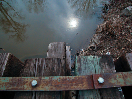 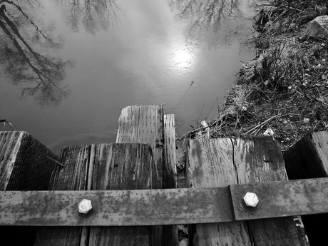
Because it is so easy to preview presets in Lightroom, I noted that the greyscale conversion preset showed some promise.
I simply made a virtual copy of the image above, increased the contrast just a little more (keeping my eye on the histogram so I didn't blow any highs or lows away) and then converted to greyscale. I really liked the results, so I published them here.
So, there it is. A few years of experience and a new workflow has taught me that, with a little work, I can achieve images I'm more pleased with. The best part of this is that I can troll through my old images looking for gems I can re-imagine. The options are endless, once you get a few techniques under your belt.
While these are not gallery ready photos, I am now more able to see the ways one can take an original image and transform it into something that represents what my eye was seeing at a specific time and place. The intention is to continue to think on how I can improve my source images while knowing that, in the digital domain, the opportunities for post-processing are endless. |