One comment

Frs10 October 29, 2007, 11:30 PM
Her er det mere officielle logo som jeg udarbejdede grundformen til. Derudover har der været to andre grafikere ind over.
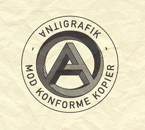
Logoet er paradoksalt, da det imiterer det anarkistiske symbol og samtidig har et meget stramt og autoritært udtryk.
Bilkfanget i logoet er dybden i umulighedsfiguren, som jeg selv synes ser rigtig godt ud. Desværre fungerer det ikke så godt når det skaleres ned. Dertil er figuren desværre for kompleks...
Add a comment...
Your name:
Your e-mail:


About 23

About 23
What is 23 and who's behind the service?
Just In
Discover the world from a different angle.
Here's a crop of the latest photos from the around the world.
Search
Search photos from users using 23
Help / Discussion
Get help or share your ideas to make 23 better
23 Blog / 23 on Twitter
Messages and observations from Team 23
Terms of use
What can 23 be used for and what isn't allowed
More services from 23
We also help people use photo sharing in their professional lives
  • Basque (ES)
  • Bulgarian (BG)
  • Chinese (CN)
  • Chinese (TW)
  • Danish (DK)
  • Dutch (NL)
  • English (US)
  • French (FR)
  • Galician (ES)
  • German (DE)
  • Italian (IT)
  • Norwegian (NO)
  • Polish (PL)
  • Portuguese (PT)
  • Russian (RU)
  • Spanish (ES)
  • Swedish (SE)

Popular photos right now