
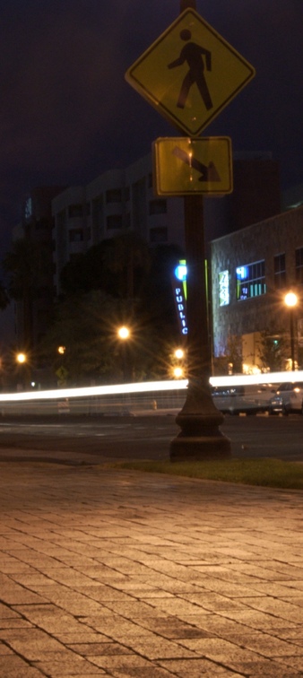
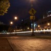
A tighter crop of the image at http://www.23hq.com/Alopex_Deserti/photo/4924769
littletank suggested a crop focusing on the parking sign, which is a good idea as the original image lacks a real subject of focus. This crop I think still doesn't quite draw you to a specific subject, although the steak of light from the passing car and flaring street lights draw you close to the middle where the word "Public" has an easier time grabbing attention. I also tried to dim the sign on the building in the background so it wouldn't seize as much attention. My first attempt was rather blatantly obvious so I think that's something I will want to practice. |
|


4 comments so far...