Share your colour scheme or your custom style for 23

Facelifting

Daniel Isenmann   November 25, 2009, 08:40 AM

Hi,
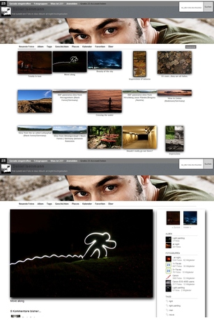
I have changed my theme to a more (in my eyes) modern look. Only the photos are visible with the description at the front page and a small shadow is around them. Also the details page of a photo has changed. The whole sidebar is now one piece and drops a shadow like the photo.

Have a look here:


Daniel

 
Steffen Fagerström Christensen Team 23   November 25, 2009, 01:58 PM

Looking good! Shouldn't you go full width for the submenu?
I love that you're using CSS for the shadow effects etc. Lovely.

 
Daniel Isenmann   November 25, 2009, 02:41 PM

Thanks. What do you mean by "submenu"? I have tried to go full width for the thumbnails on the frontpage, but that doesn't worked well.

 
Steffen Fagerström Christensen Team 23   November 25, 2009, 02:49 PM

The submenu is the #tabs element; Latest, Albums, Tags, Stories, Places, Calendar, Favorites, About etc.

 
Daniel Isenmann   November 25, 2009, 04:19 PM

Thanks for the hint. I have now changed it to full width. Looks better now.

 
To participate in this conversation, you'll need to join the group


About 23

About 23
What is 23 and who's behind the service?
Just In
Discover the world from a different angle.
Here's a crop of the latest photos from the around the world.
Search
Search photos from users using 23
Help / Discussion
Get help or share your ideas to make 23 better
23 Blog / 23 on Twitter
Messages and observations from Team 23
Terms of use
What can 23 be used for and what isn't allowed
More services from 23
We also help people use photo sharing in their professional lives
RSS Feed
Subscribe to these photos in an RSS reader
  • Basque (ES)
  • Bulgarian (BG)
  • Chinese (CN)
  • Chinese (TW)
  • Danish (DK)
  • Dutch (NL)
  • English (US)
  • French (FR)
  • Galician (ES)
  • German (DE)
  • Italian (IT)
  • Norwegian (NO)
  • Polish (PL)
  • Portuguese (PT)
  • Russian (RU)
  • Spanish (ES)
  • Swedish (SE)

Popular photos right now