
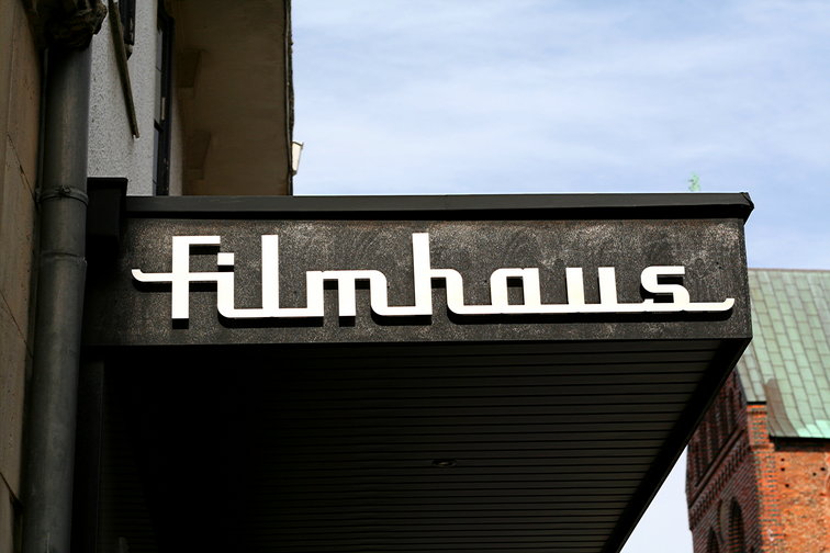
this is the logo / entrance of a small independent movie theater in Lübeck. I love the retro typography.
I considered straigtening and cropping this but somehow I like how it turned out. |
|
|
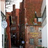
this is the logo / entrance of a small independent movie theater in Lübeck. I love the retro typography.
I considered straigtening and cropping this but somehow I like how it turned out. |
|
About 23
Just In
Discover the world from a different angle.
Here's a crop of the latest photos from the around the world. |
Popular photos right now                     |

3 comments so far...
I think it is some kind of brushed metal.
Sometimes I wonder about typography and designs - everything nowadays looks like some McD or Starbucks clone, uniqueness seems to have lost its value, the warholism of pop culture?
on typography: Ich stimme mit dir überein :)
but there is always the hope of a little "Renaissance" among designers...
i think you'd find this page interesting dhania, since you have appreciation for typography
http://www.typofonderie.com/
cheers :)