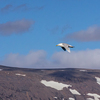
Taken at the lakes of Copenhagen.

Some parts of the picture looks burnt out. This is due to my attempt to make this look good in a browser that doesn't support colour profiles(every browser besides Safari). This picture got about +50 of saturation and +35-ish of contrast if not more.


6 comments so far...

Lau February 13, 2008, 12:06 AM
nice
PimpDaddy February 13, 2008, 10:58 AM
Thank you :-)
claus kunckel February 13, 2008, 11:45 AM
Ja, flot. Men en kende i overkanten til min smag. Jeg ville nok beskære enten noget himmel eller vand væk. Ihvertfald så horisonten ikke er midt i billedet. Men imponerende farver!
PimpDaddy February 13, 2008, 12:10 PM
Thank you. Billedet tager sig en del bedre ud i en knap så tunet udgave set med Safari. Jeg smider den op senere i aften, så må vi se om du kan lide den(ikke at du partout skal) :-)
Buddahgraphix February 15, 2008, 09:47 AM
WOW, det ser godt nok vildt ud :) ligner at farverne er malet på!
PimpDaddy February 15, 2008, 08:25 PM
Yeah, HDR kan være fedt.

@ Claus: Ja den knap så tunede udgave kom så ikke op som lovet. Men mon ikke jeg når det snart :-)

Add a comment...
Your name:
Your e-mail:


About 23

About 23
What is 23 and who's behind the service?
Just In
Discover the world from a different angle.
Here's a crop of the latest photos from the around the world.
Search
Search photos from users using 23
Help / Discussion
Get help or share your ideas to make 23 better
23 Blog / 23 on Twitter
Messages and observations from Team 23
Terms of use
What can 23 be used for and what isn't allowed
More services from 23
We also help people use photo sharing in their professional lives
  • Basque (ES)
  • Bulgarian (BG)
  • Chinese (CN)
  • Chinese (TW)
  • Danish (DK)
  • Dutch (NL)
  • English (US)
  • French (FR)
  • Galician (ES)
  • German (DE)
  • Italian (IT)
  • Norwegian (NO)
  • Polish (PL)
  • Portuguese (PT)
  • Russian (RU)
  • Spanish (ES)
  • Swedish (SE)

Popular photos right now